Does my website need more animations? Or is static design still enough?
Are animations making websites better or just more distracting? This post breaks down when motion design enhances usability—and when it goes too far—so you can strike the right balance.
Are you also noticing more websites that feel over-the-top, or is it just me? Pages where everything moves (sometimes at different speeds!) scrolling feels off, and animations stutter like the site is struggling to keep up?
What you're seeing is the ripple effect of a motion design boom. Suddenly, every brand is reworking its website to keep up. Some are nailing it, but others? Not so much. There’s a fine line between engaging motion and visual overload.
Meanwhile, web design awards now overwhelmingly favor animation-heavy sites, making you wonder: Do I need animations on my website? If static designs aren’t winning awards, are they still good enough for visitors?
In this post, we’ll break it all down—with real-world examples of motion done right and where it goes too far—so you can make smart decisions about when to add movement and when to keep it simple.
Why is motion design everywhere right now?
Motion design isn’t new, but it’s having a moment. It’s no longer just a nice-to-have—it’s becoming the default for modern websites. Scroll-triggered animations, fluid transitions, and interactive elements are everywhere. But why? Here are a few reasons why motion-heavy websites are taking over:
1. Big brands are setting the trend
Apple, Tesla, and Adidas have embraced motion-heavy design, using fluid scroll effects, interactive product pages, and cinematic animations to create immersive experiences. When major brands do something, everyone else follows. Even smaller businesses are reworking their websites to keep up.
2. Social media & video-first content are changing expectations
People spend hours scrolling through TikTok, Instagram Reels, and YouTube Shorts—platforms built on constant motion and engagement. As a result, users expect more dynamic and interactive experiences on websites too. A static page can feel boring in comparison.
3. Web design awards favor motion
Look at recent winners on Awwwards, CSS Design Awards, and FWA. They all have one thing in common: heavy use of animations, transitions, and interactive elements. Clean, static designs rarely make the cut. This has led to more designers prioritizing motion, not just for usability, but because it’s what gets recognized.
4. No-code tools make animations easier to implement
A few years ago, adding advanced motion effects required a developer with serious JavaScript skills. Now? Webflow, Framer, and Wix Studio let designers create smooth animations without touching code. This accessibility means more brands are experimenting with motion—even when they don’t always need it.
5. AI & advanced animation tools are fueling the shift
AI-powered design tools like Spline (3D), Rive (interactive animations), and Lottie (lightweight vector animations) make motion design more accessible than ever. With these tools, even non-designers can add high-quality, dynamic elements to their sites—often with just a few clicks.
When animations enhance the user experience
Motion isn’t just about aesthetics—it plays a crucial role in usability, engagement, and storytelling when done right. Well-executed animations can guide users, provide feedback, and create a more intuitive browsing experience. Below are the key scenarios where motion design truly improves websites, along with real-world examples of brands that get it right.
1. Helping users navigate more smoothly
Animations can act as visual cues that help users navigate content effortlessly. Instead of overwhelming visitors with a static wall of text or cluttered UI, motion can subtly direct their focus to the most important elements. Smooth scrolling effects, progressive reveals, and well-timed transitions can really make exploring a website feel intuitive rather than overwhelming.
Example: Stripe - Smooth scrolling animations and hover effects guide users through complex pricing and product pages. As visitors hover over different plans, pricing details animate into view, making comparisons easier.
Stripe's landing page animation showing the interface of their payment app
2. Providing feedback and improving usability
There are few things more frustrating than clicking a button on a website and wondering if it actually worked. Animations can provide instant feedback to reassure users that the action has been recognized — even if it is as simple as a button changing size or color when clicked. That small animation reassures you that you are on the right track. Most modern websites already do this.
3. Creating a memorable brand experience
A website is often the first interaction users have with a brand—motion design can help make that experience unforgettable. Well-placed animations add personality, reinforce branding, and make the interaction feel more premium and high-end. Instead of just telling users what makes a product great, motion allows brands to showcase their story dynamically.
Example: Apple's iPhone 16 - As you scroll, the iPhone's components smoothly assemble, visually reinforcing the product’s precision and craftsmanship. Instead of static images, Apple uses motion-driven storytelling to create an engaging experience.
Example: Tesla - The interactive car configurator updates in real time as users customize their Tesla. Motion makes the experience feel immersive and premium, reinforcing Tesla’s futuristic brand identity.
4. Making information easier to understand
Complex information, data-heavy content, or step-by-step processes can be difficult to digest when presented statically. Motion design helps by breaking down information into bite-sized, visually engaging pieces. Instead of forcing users to read a dense paragraph, animations can simplify concepts through animated illustrations, transitions, and progressive disclosures.
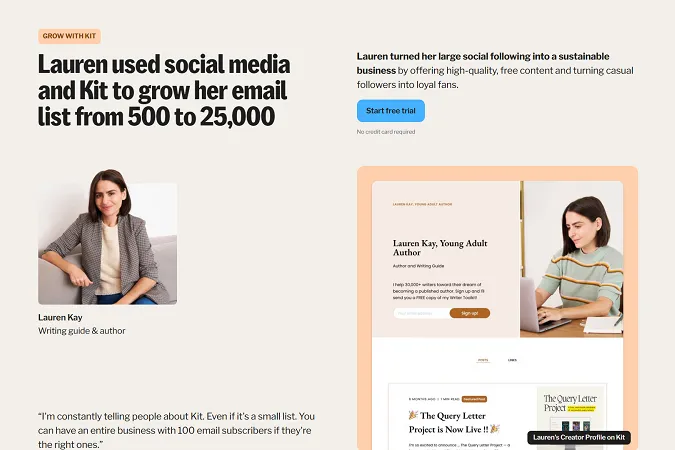
Example: Airbnb - Instead of listing travel benefits in plain text, animated icons and visuals illustrate each key selling point as users scroll. This makes information easier to scan and understand.
AirBnB website hover effect animation to see host details
When animations hurt the user experience
While animations can make a website feel modern and dynamic, too much motion—or the wrong kind—can create frustration, slow things down, and even drive users away. Poorly executed animations often feel more like distractions than improvements, making the site harder to use rather than more engaging. Here are some common ways animations can backfire, along with real-world examples of where they go wrong.
1. Slowing down the website
Animations can drag down load times, especially when they rely on heavy JavaScript, large video files, or excessive CSS animations. A common culprit? Full-screen autoplay videos in the hero section. These might look impressive, but if they take too long to load, visitors won’t stick around—they’ll bounce before they even see the content. I’ve also seen this happen with large sliders packed with high-resolution images.
This is why I always recommend keeping the hero section simple and focusing on the key message: Who we are and what we do. A website’s first impression should be about clarity, not aesthetics. If large images are slowing things down, I highly recommend optimizing them—check out this article on how to optimize images for faster website speed.
I see this issue a lot with Awwwards-winning sites—many are beautifully designed but prioritize visual effects over speed and usability. Long intro animations, heavy video backgrounds, and resource-heavy transitions may look great in a demo but often make real-world navigation frustrating. While these designs showcase creativity, they don’t always translate into fast, user-friendly performance, which is crucial for businesses that rely on conversions.
2. Messing with the "scroll"
Ever scrolled through a website and felt like it wasn’t moving at the speed you expected? That’s called forced auto-scroll, and while it can create a “cinematic” effect, it often disrupts the natural feel of browsing. Instead of smoothly scrolling through content at your own pace, you’re forced to move at whatever speed the website dictates.
Sometimes this can add to the wow factor, but overdoing it becomes frustrating—especially when you’re trying to read something before it slides away on its own. This is when animations start working against the user rather than enhancing the experience.
I’ve had clients get excited about these effects and want to take it a step further by replacing the browser’s default scrollbar with a custom one. I always recommend against it. When it comes to UX, you have far more to lose than gain by overriding a fundamental browser function.
3. Creating motion sickness or accessibility issues
Not everyone reacts well to fast-moving visuals. Excessive motion, sudden transitions, or parallax backgrounds moving at different speeds can make some users feel dizzy or disoriented. This is especially true for people with vestibular disorders, who may experience nausea or headaches from unnecessary movement.
Websites that flash between high-contrast colors too quickly can also be problematic for users with photosensitivity. While accessibility might not always be the first thing people think about when designing animations, it should be—because if certain visitors physically can’t use your website comfortably, they won’t stick around.
A simple solution? Give users an option to reduce motion. Many modern operating systems and browsers allow users to enable a "reduce motion" setting, and websites should respect that preference.
4. Distracting from the core content
Animations should support the content, not compete with it. If everything on the screen is moving—text bouncing in, images sliding, buttons pulsing—users don’t know where to focus. Instead of drawing attention to key elements, animations can turn the entire experience into a sensory overload, making it harder to absorb information.
One of the biggest offenders are cursor-triggered animations. Some websites tie motion effects to mouse movement, making elements stretch, shift, or react with every tiny cursor movement. While this might seem interactive at first, it quickly becomes distracting—especially when you’re just trying to read or click a link.
A website should feel fluid and intuitive, not like a game where users have to “chase” stable content. If motion is getting in the way of usability, it’s not enhancing the experience—it’s hurting it.
Best practices for using animations effectively
The Nielsen Norman Group puts it perfectly:
"Animation in UX must be unobtrusive, brief, and subtle."
That’s exactly what this section is about—using motion in ways that add value without getting in the user’s way.
1. Keep animations lightweight and prioritize performance
✅ Use CSS animations instead of JavaScript whenever possible—they’re lighter and more efficient. ✅ Compress images, videos, and Lottie animations to reduce file size without sacrificing quality. ✅ Test animations on mobile—effects that look great on desktop might feel sluggish on slower devices.
2. Use motion to guide users, not distract them
Animations should help users understand what’s happening on the screen and guide their focus—not compete for attention. If too many elements move at once, users won’t know where to look.
✅ Use motion to indicate changes in state (e.g., hover effects, form validation feedback). ✅ Keep animations short and subtle—delays longer than 300ms feel slow. ✅ Avoid distracting entrance animations—text and images should appear naturally, not bounce or slide dramatically.
Dropbox uses timed text reveals to guide people through their message
3. Let users stay in control
One of the most common mistakes in motion design is forcing animations onto users. A website should feel intuitive, not like it’s taking control away from visitors.
✅ Avoid auto-scrolling effects—let users navigate at their own pace. ✅ Provide an option to reduce motion for users sensitive to excessive movement. ✅ Keep UI transitions snappy—animations should be fast and seamless, not slow and theatrical.
4. Use motion to reinforce brand identity (without overdoing it)
Animations can make a brand feel more dynamic and memorable—but too much motion can feel gimmicky. The key is consistency and moderation.
✅ Choose animations that match your brand’s personality (e.g., smooth and refined for luxury brands, playful bounces for creative agencies). ✅ Keep motion consistent across the site—random effects in different sections make the experience feel disjointed. ✅ Use motion strategically, like subtle logo animations or background effects that enhance the brand without stealing focus.
5. Test animations with real users
Just because an animation looks great in a Figma prototype doesn’t mean it will work well in practice. Testing animations with real users is essential to ensure they enhance—not hinder—the experience.
✅ Conduct usability tests to see if animations make interactions smoother or slower. ✅ A/B test animation styles—compare engagement with and without motion. ✅ Monitor analytics—if users drop off quickly, animations may be causing frustration.
TL;DR - Key takeaways
Animations should be subtle and purposeful. Motion shouldenhance usability, not overshadow it. If it’s just there to look cool,reconsider it.
Performance matters. Heavy animations slow websites down.Use lightweight CSS animations, optimize assets, and test speed on mobiledevices.
Guide users, don’t distract them. Motion should help usersnavigate by drawing attention to key actions, not competing for their focus.
Let users stay in control. Avoid forced auto-scrolling andunnecessary motion that disrupts natural browsing.
Match motion to your brand identity. Use animations thatreinforce your brand’s personality while keeping the experience clean andconsistent.
Test with real users. A/B test animations, monitorengagement, and adjust based on user feedback—if it’s slowing people down, it’snot working.
Bottom line: Animations should feel smooth, fast, andinvisible when done right—if users notice the animation more than the content,it’s too much.
Over 300 businesses have used my templates to launch their websites faster and look more professional online. Go live in half the time and at a fraction of the cost of custom development, with one of my professionally designed and fully customizable website templates.


%20(1).gif)


.webp)